Bayesian Images
Graphs to accompany my poster presentation.
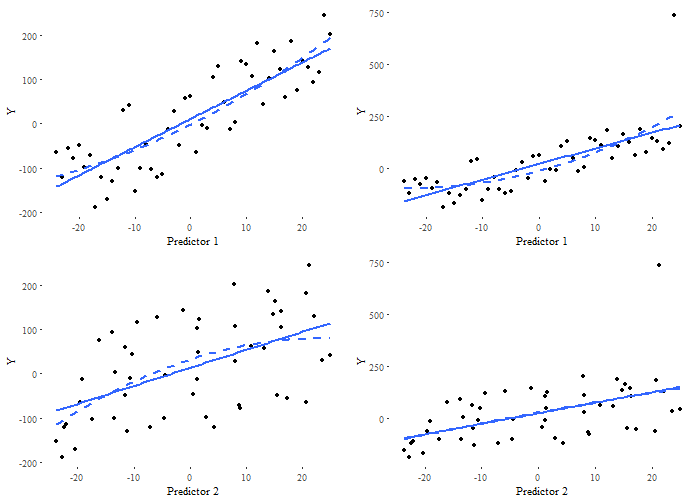
The data set
The generated data is plotted below:
Metropolis Hastings Algorithm
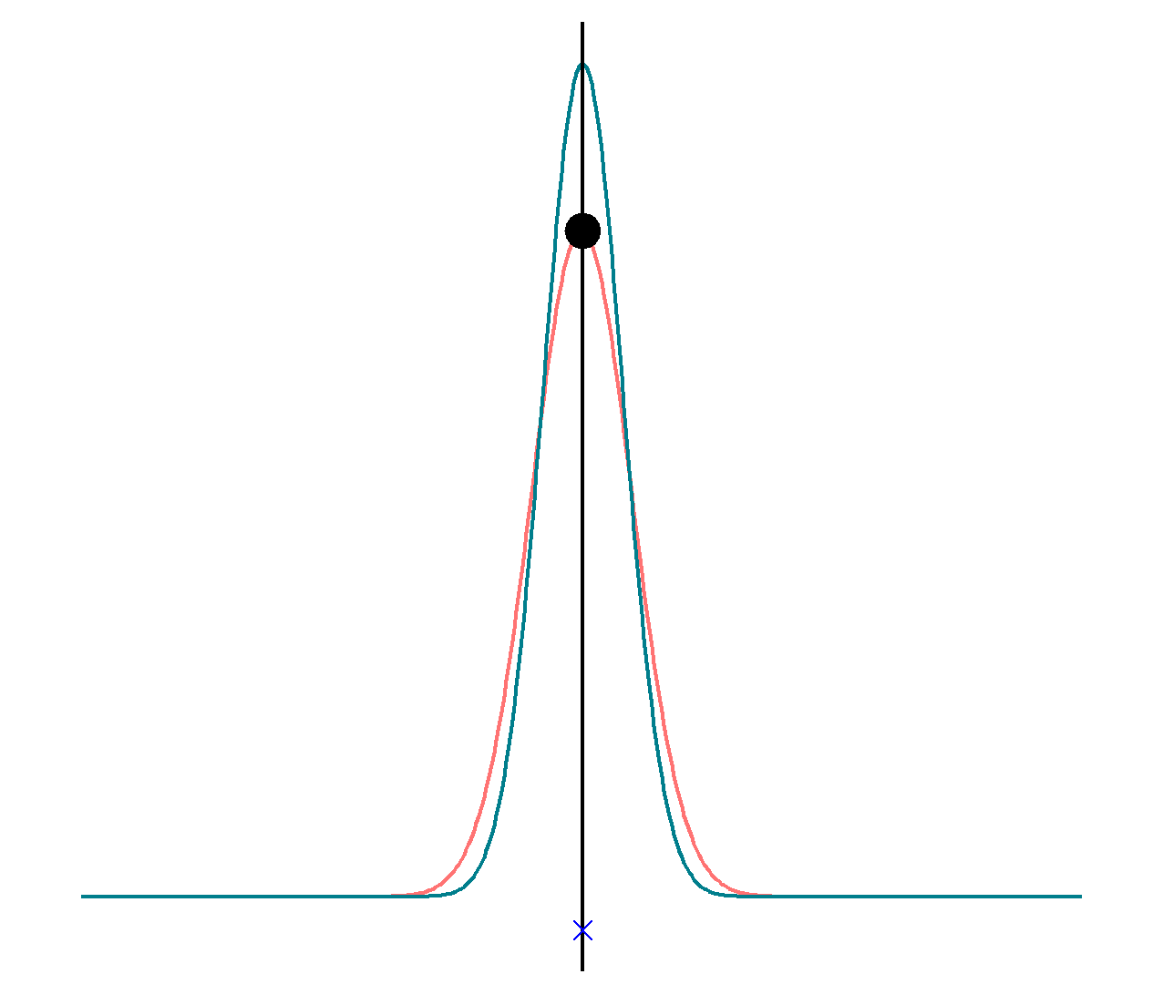
This visual explanation of the Metropolis Hastings algorithm shows the proposal and the true density along with the Metropolis Hastings step. It was inspired and adapted from code by Balazs Torok.
Diagnostic Plots for Beta 2 via Gibbs Sampler
Autocorrelation Plot
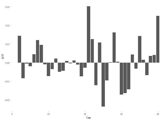
The autocorrelations are negligable, suggesting good mixing.
Running Means Plot
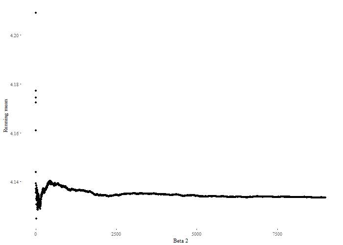
The running means have settled.
Three chain trace plot
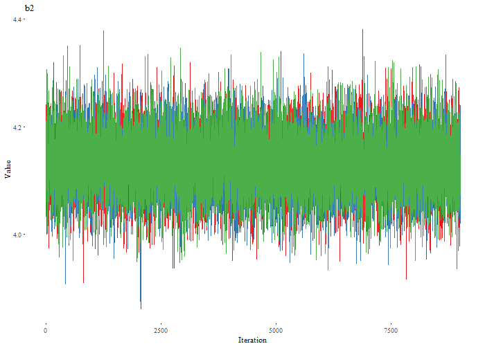
All three chains seem to be in the same place.
Posterior Predictive Checks
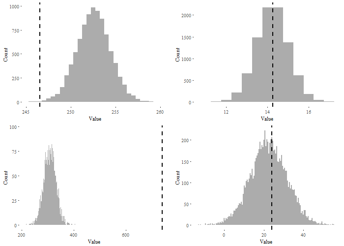
On the left side you can see the two predictive check using the maximum as a statistic. On the right hand side you see the maximum as a statistic, and on the left hand side you see the mean.
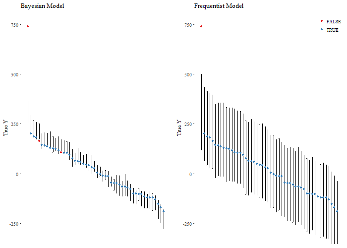
This is a check of predictive accuracy of both models, for all cases, ordered from greates to smallest.